Last year, after my time at VIKTOS, I was approached by a gov/mil specialty brand to make “a tee shirt like VIKTOS makes” – which I deciphered as “something with a flair for kitsch and intended for a specific group”.
The client needed a t-shirt for an ADS Warrior Expo Show, specializing in government tactical equipment.
UNFORTUNATELY, This PROJECT WAS NEVER PAID FOR WORK DONE, AND NO APPROVALS WERE PROVIDED AFTER MESSAGING PHASE. WE HALTED WORK AT THE SKETCH PHASE, AND THAT IS THE WORK YOU WILL SEE IN THIS ARTICLE – INCOMPLETE. BUT IT HAD PROMISE!
ALL RIGHTS HAVE REVERTED BACK TO GUNLAND.
The shirt was to showcase a plate carrier they were promoting and to target US Navy Seals. Specifically, combat diving operations.
Like most companies in the industry, they wanted skeleton-heavy illustrations. This style of illustration has been popular for ages. From early military patches for various platoons, and in modern times, the works of Gypsy Walters as an example.
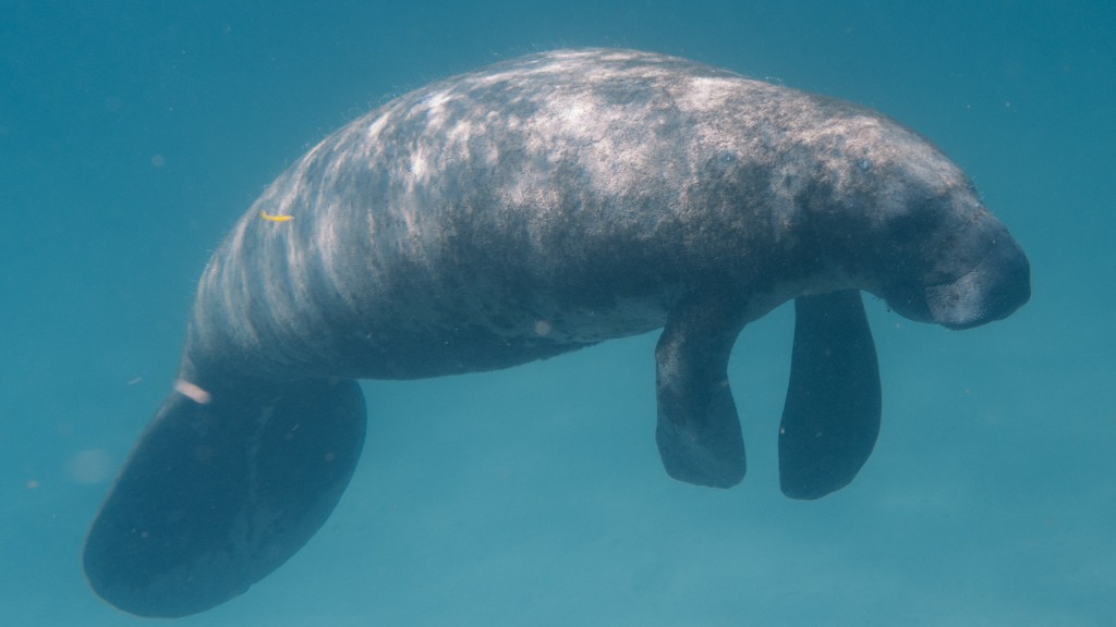
Their product had a colorway that utilized “manatee” as a name. I asked on the kick-off call if using a manatee in the art would be acceptable for creative ideation. They seemed hesitant but were willing to head down the path with me.
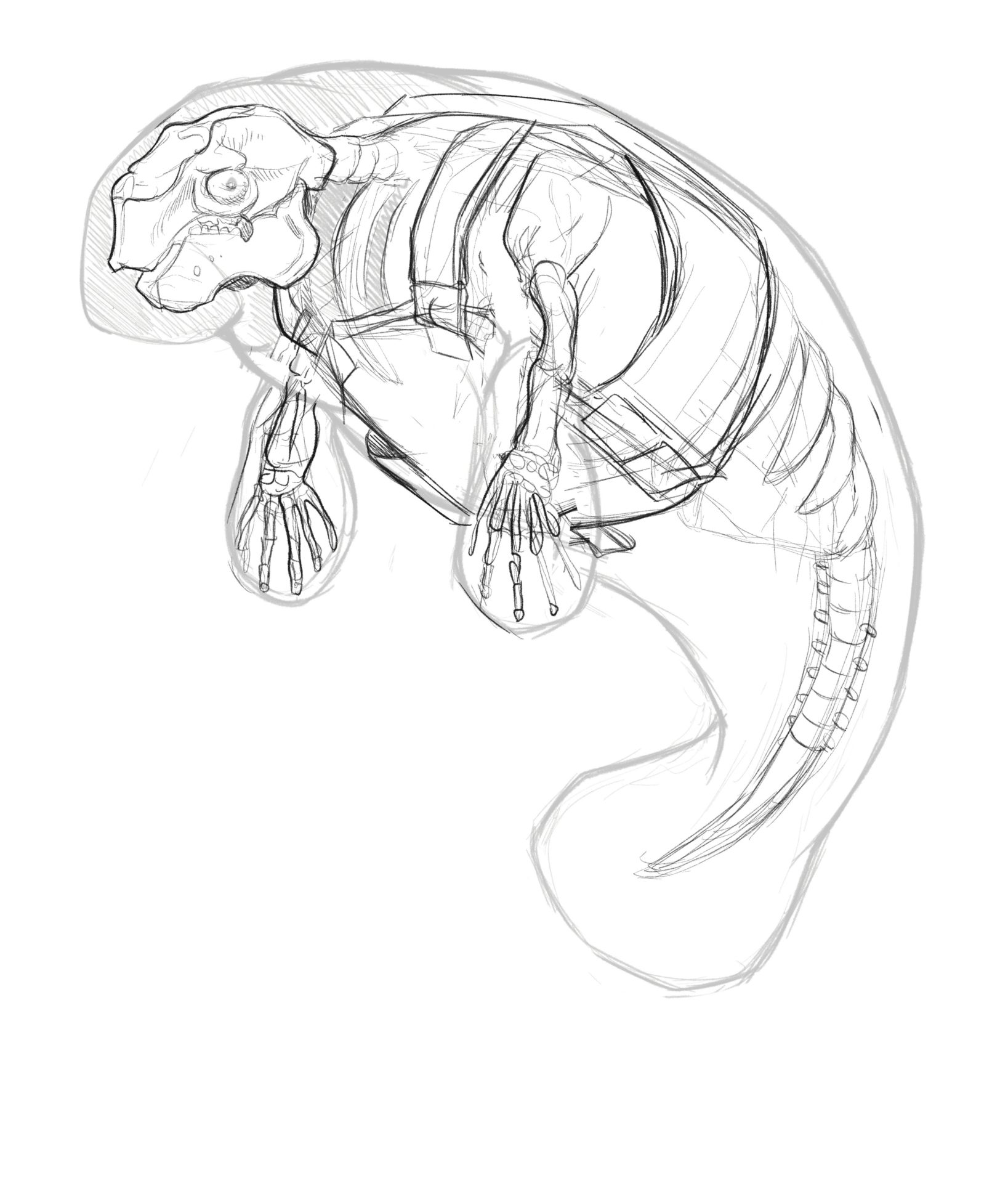
After the call, I Googled “manatee skeleton” and was greeted with the primordial visage I was looking for.
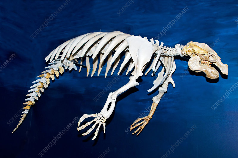
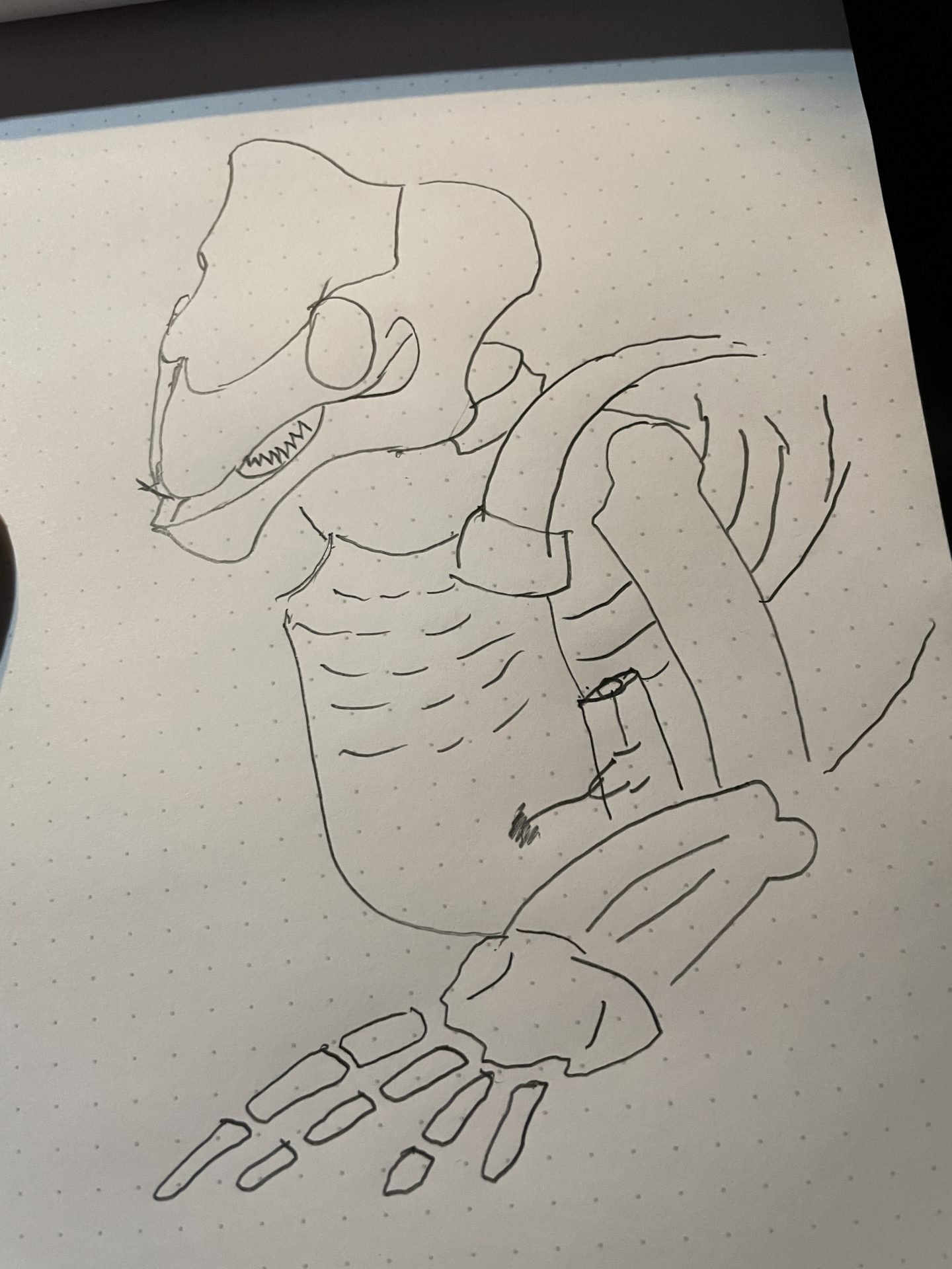
Quickly, I threw this sketch down on my Bullet Journal pad and felt that there was some promise in this direction. My partner in creative, Jake Murray, and I set to concepting.
Living in Portland Oregon -a town with some of the most influential marketing agencies in the US- provides an abundance of creative talent to explore and appreciate. We were searching for an illustrator that maybe had some National Geographic-style animal-bone structure drawings. We found the perfect artist for the work.
The Concepts
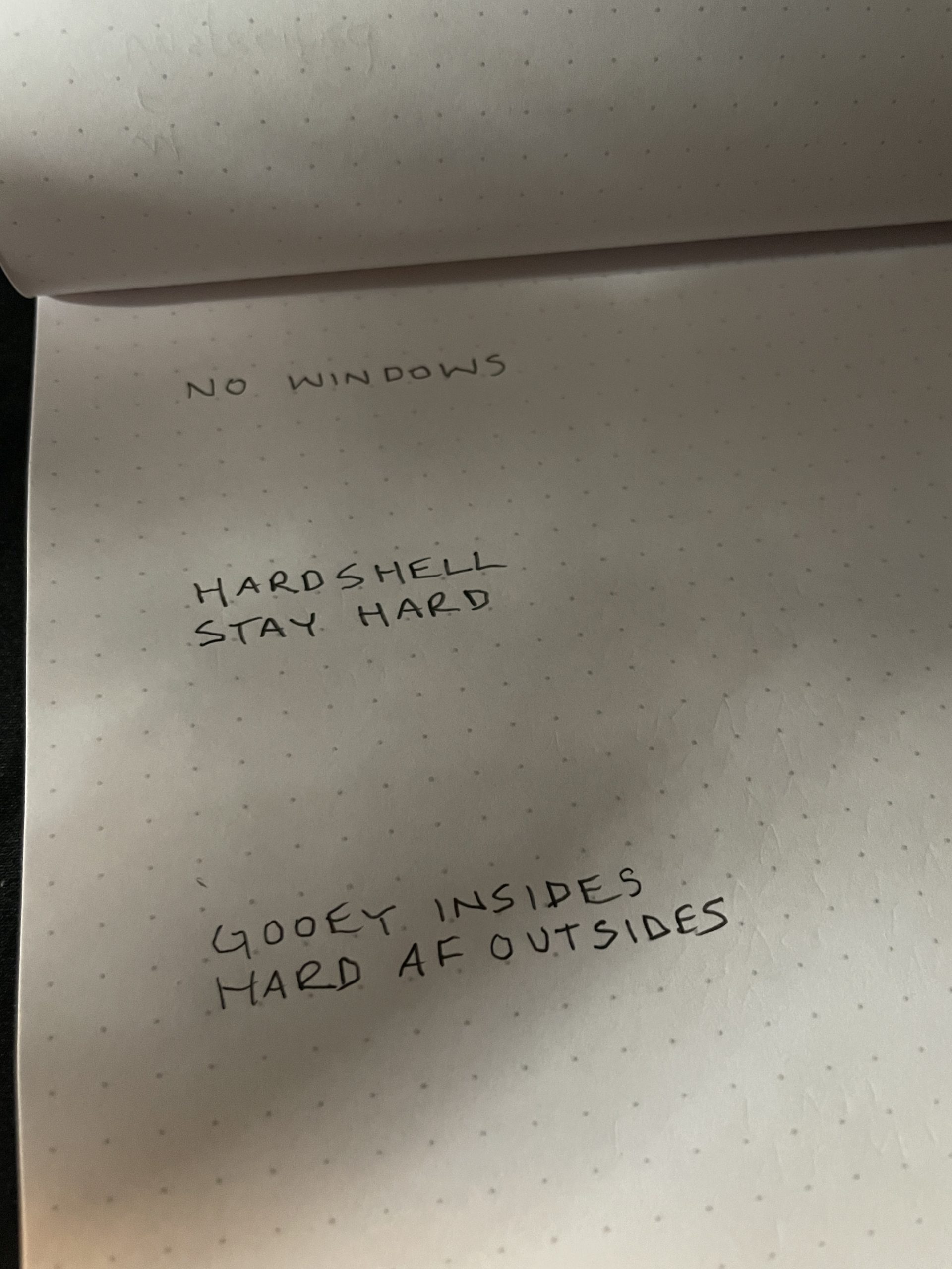
Concept 1
No Windows.
Showcasing how this particular plate carrier protected the wearer from all angles.
Concept 2
Hard Shell.
Stay Hard.
Underneath it all, we’re squishy. The plate carrier provides hard shell protection.
Concept 3
Gooey outsides.
Hard AF Outsides.
An additional variation of Concept 2.
The client elected to proceed with ‘Concept 2’:
STAY HARD.
Working with a talented local illustrator, we produced three directions with two variations.
Three Directions
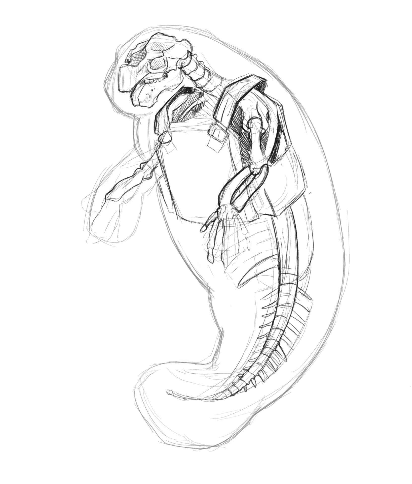
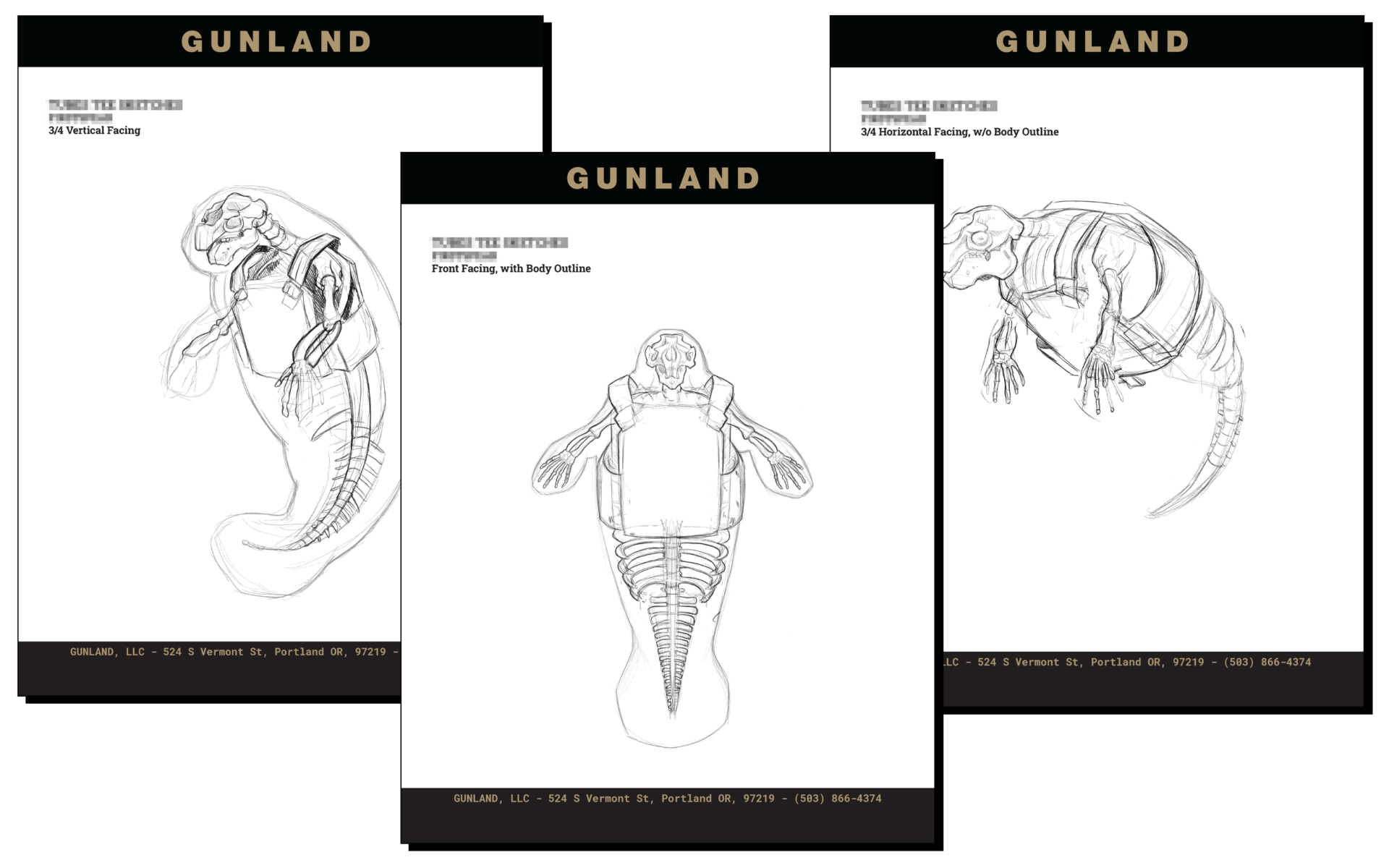
3/4 Vertical Facing
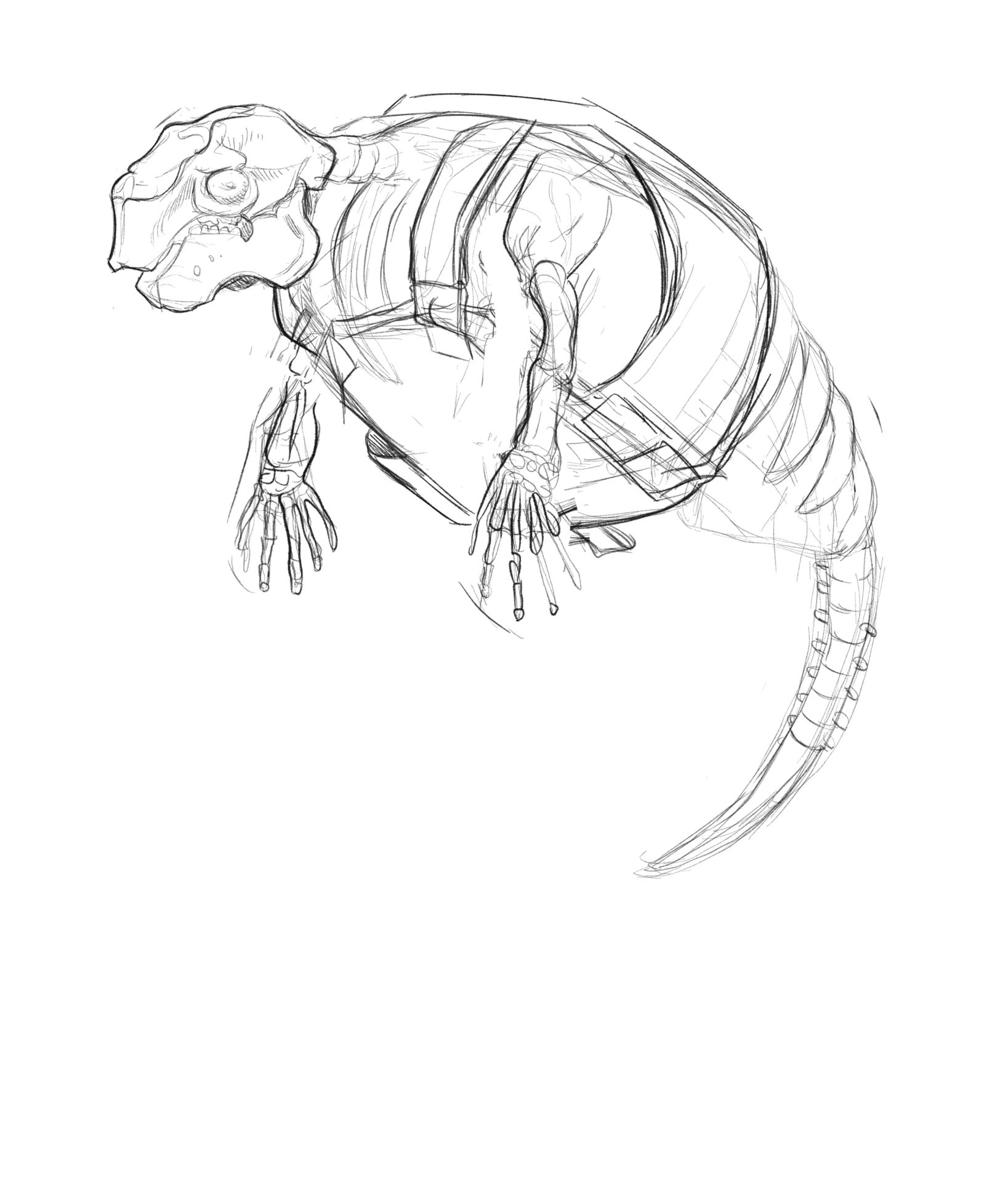
This is the refinement of the original mock sketch and shows the front of the carrier quite well.
3/4 Horizontal Facing
This angle is the most natural position for the manatee. It shows the sidewalls of the carrier best of the three. The side walls are important to show the aquatic bellows in the carrier, etc.
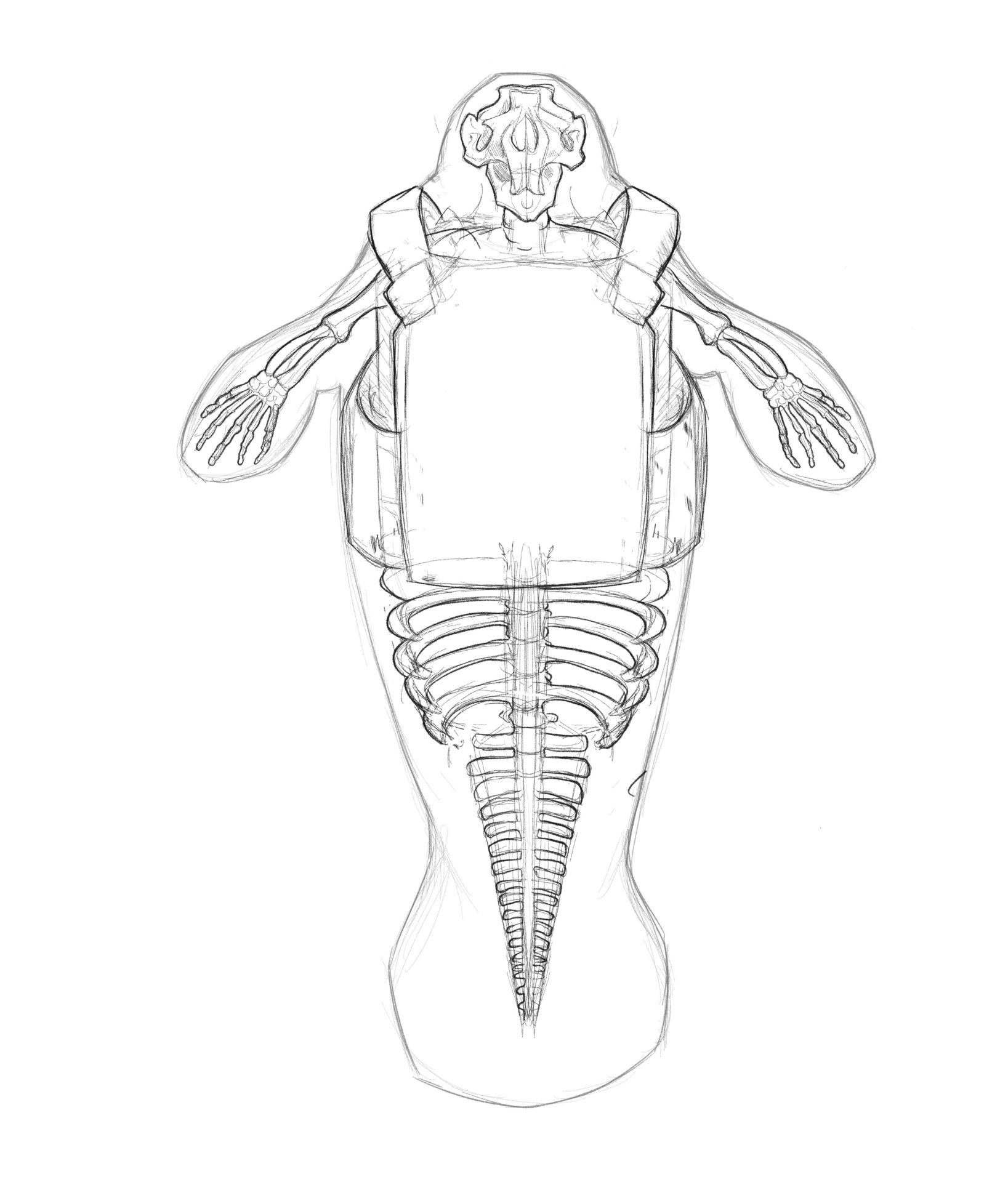
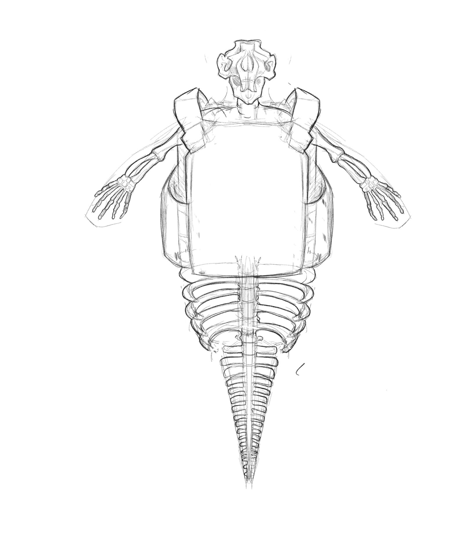
Front Vertical Facing
This angle was to really highlight the plate carrier. This execution is very strong but is more diagrammatic and static.
To Chub, or Not To Chub.
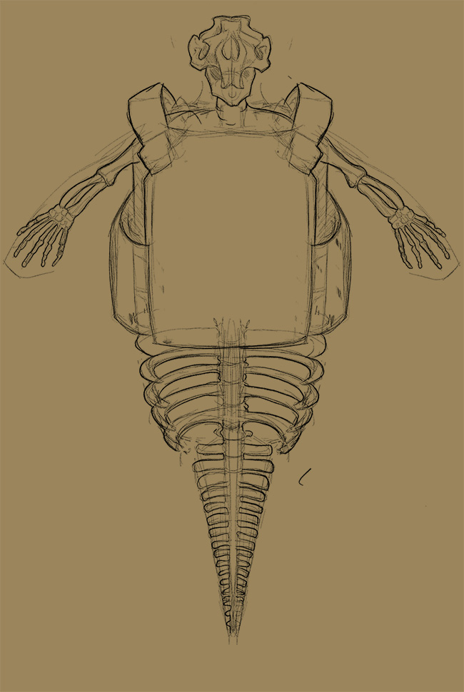
Skeletal Structure Only
The manatee looks quite menacing with the skeletal structure as the focus in the illustration.
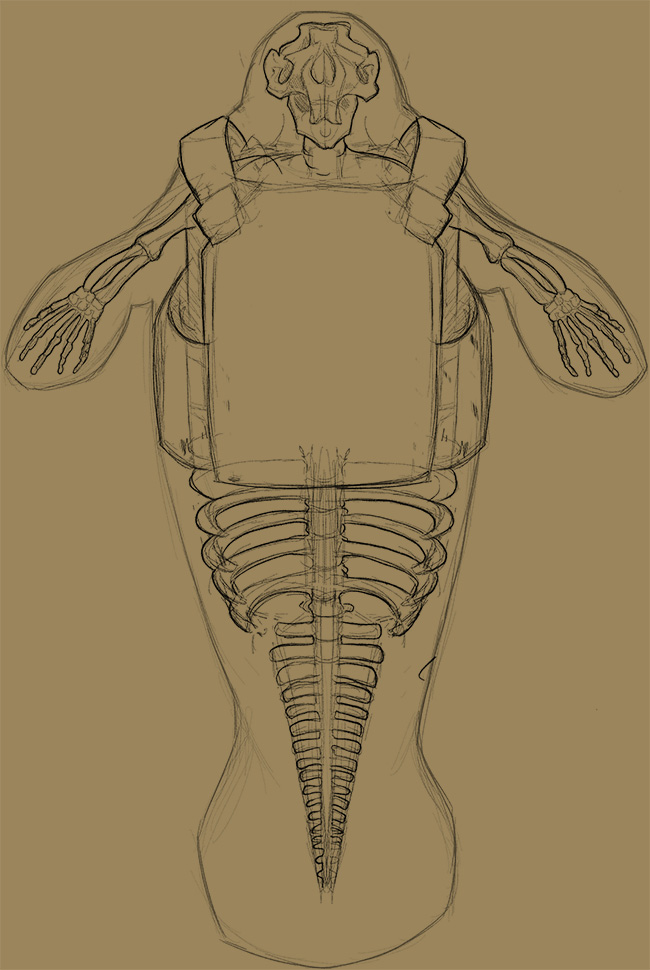
Body Outline
But without its iconic thick body, most would not know what the skeleton was of. Adding a slight silhouette provided good context.
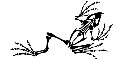
It was at this juncture that the project stalled, and the client walked away from the work. There were concerns the drawings were too reminiscent of – and may offend – the BONE FROG illustration which honored fallen US Navy SEALS, or that the work wasn’t on brand.
Creative work is subjective work, and not everyone is going to like everything you create 100% of the time. But we do continue to strive.
A Takeaway
As projects go, this was both fun, and frustrating. Fun to be creating truly unique pieces of content. Frustrating that it never made it over the goal line.
I did come to a real item of note for future “cool” customer-centered goods originating from a marketing department:
- Is this good to be sold?
- Or, is this a good to be given away as exposure?
We were working down a path of making a real good that was of a quality that someone would want to purchase. Not something that was just a logo, or brand point that most would accept freely, but not with their hard-earned money.
Each project is a lesson.